Typography
Follow these font guidelines when representing HelloTalk across different channels and touchpoints.
Our Type
Roman alphabet / Arabic / Cyrillic
Font use changes based on writing language:
For Roman alphabet, Arabic, and Cyrillic:
Headers: Gellix is used sparingly and is reserved for standout text such as titles
Body text: SF Pro (in-app) and Inter (external)
For Korean, and Chinese and Japanese characters use HarmonyOS Sans SC
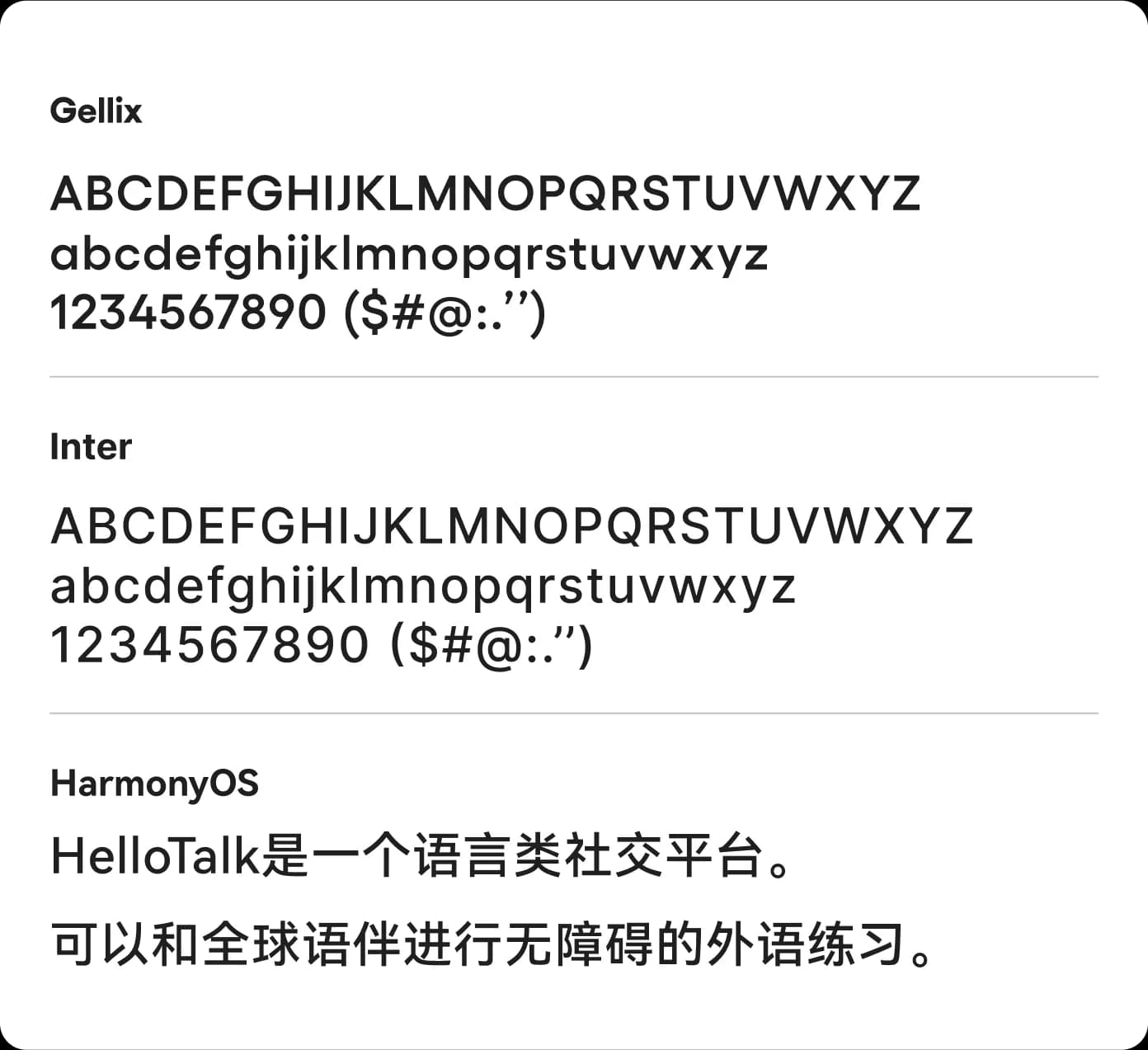
Gellix
Headlines / Accent typography
Inter
Product UI & long-form text
HarmonyOS
Headlines / Accent typography
Using Gellix
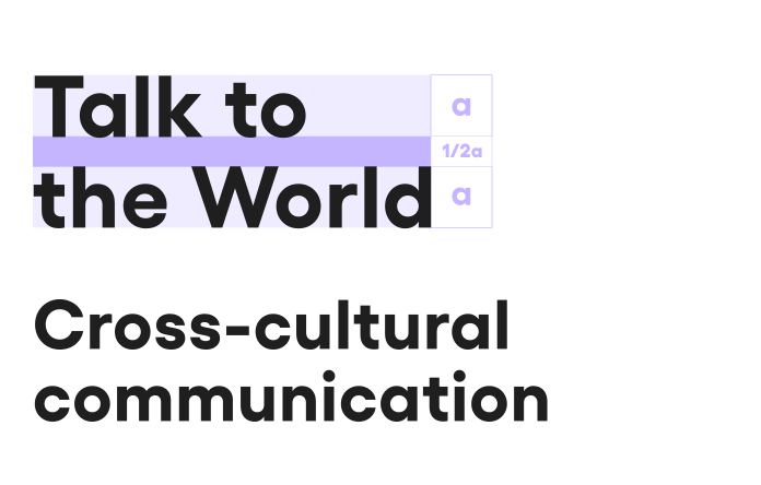
- Use Gellix Bold for writing titles in English and other languages that use the roman alphabet.
- Line spacing: 1/2 of the font height.
- Letter spacing: Use 2% letter spacing.
Using Inter
- Use Inter Medium for subheadings and all body text. This applies to English and all other languages that are written using the roman alphabet.
- Line spacing: Set to 130%. Gradually decrease line spacing as font size increases.
- Letter Spacing: Set to 0%.
Moments
Moments are public posts that let you engage with the entire community. Share an update or ask a question about language, culture, or travel for native speakers to see and comment on.
Using HarmonyOS Sans
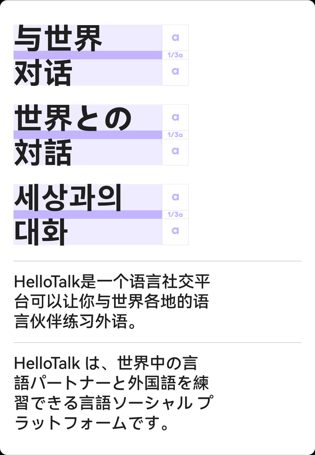
- Use HarmonyOS for Chinese, Japanese, and Korean.
- Title line spacing: 1/3 of the font height.
- Text line spacing: Set line spacing to 140%. Decrease the line spacing as the text size increases.
- Letter spacing: Set to 2%
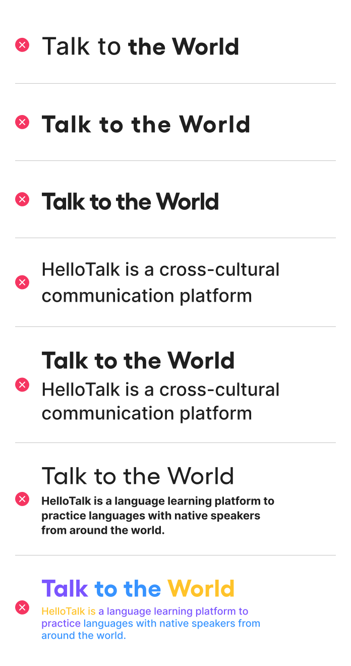
Please don’t
- Use multiple fonts of different weights in the same sentence.
- Keep too much spacing between words in a title or paragraph.
- Use overly narrow letter spacing.
- Use too much line spacing between sentences.
- Do not use a font height ratio between the main text and the title that deviates significantly from 1:3.
- Don't use Medium weight for titles, and bold weight for paragraphs.
- Don't use more than two colors for titles and paragraphs.