Brand Colors
Our brand palette is made up of a series of violets that complement both light and dark backgrounds. These color combinations are used both in-app and externally. We keep things fun, fresh, and vibrant with our secondary colors.
Primary Colors
Our primary colors cover the majority of space in our products and services. They have strong contrast for visibility and can be used as a background canvas, or as headers and paragraph text to create engaging and well contrasted copywriting.
Violet 50
#7A54FF
Blue 50
#3793FF
Turquoise 50
#00D387
Red 50
#F53561
Yellow 50
#FFC32A
Violet 90
#2E1F6D
Color Palette
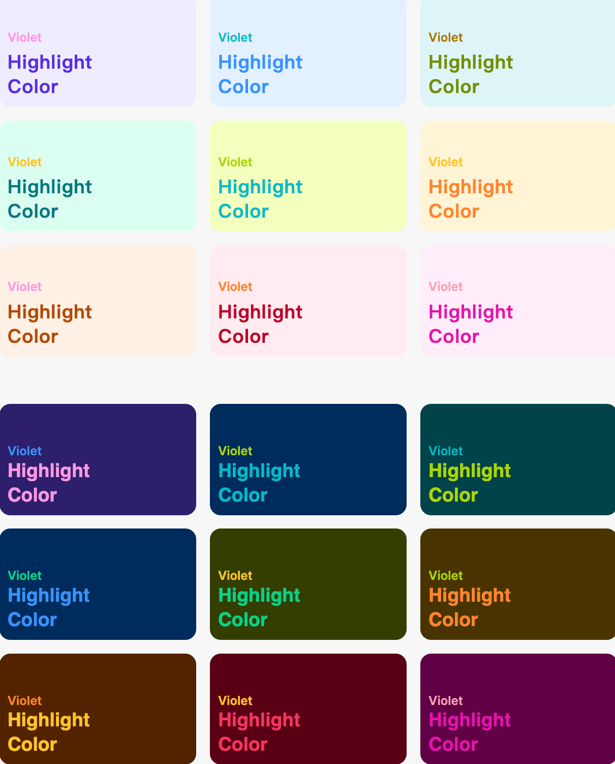
Our diverse color palette allows us to express ourselves across a variety of scenarios while also covering the main colors used in major global celebrations. These auxiliary colors are great for highlights, icons, and banners in the HelloTalk App. The next section includes suggested color combinations for both light and dark mode.
Light & Dark
Use the core colors for the background color of critical brand assets such as the website and HelloTalk App. For flexibility, secondary assets used in marketing campaigns or operational activities may use other colors. Here are a few suggested color combinations when using light mode.Here are a few suggested color combinations when using dark mode